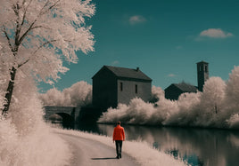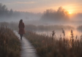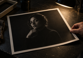


Sequence Photography Prints by Comparing Tonal Weight
When you sequence photography prints, compare how much attention each one pulls. Do not judge brightness in isolation. A pale image may feel calm on its own but become forceful beside a very dark print.
Tonal weight is the sense that one area or image pulls more attention than another. High luminance, which means visible brightness, can add weight. Strong color can do the same. Adobe's guide to photography composition notes that greater luminance or color saturation can pull the eye. Saturation means the strength or purity of a color.
Place all prints together and find the visual high points. A print with a white sky, bright face, or vivid red sign may command the group. That is not a flaw. It simply gives that print more power in the order.
Judge Every Pair as a Visual Handoff
A series is built from small transitions. Cover every print except the first two. Ask where your eye lands in the first image. Then uncover the next print. Does attention move into it, or does the first print keep pulling you back?
Repeat this check for every pair. A bright print may make a quiet dark image seem weak when they sit together. The dark image might work better after a midtone print, or after an image that shares its subject.
You do not need a smooth fade from light to dark. A gradual shift can feel calm, but it is only one option. The goal is to control each handoff. If a sharp change appears, it should have a clear job. Think about pace, story, and where you want the viewer to pause.
Carry the Eye With Direction and Repeated Elements
Brightness is only one part of flow. A face looking right can send attention toward the next print. A road, arm, shadow, branch, or line of buildings can do the same. These are directional elements. Within one photograph, they are often called leading lines because they guide the eye toward a subject.
Use that direction across the gap between two prints. If the subject in one image looks out of the series, try reversing the order or moving the print to an edge. The gesture should feel like an invitation, not an exit.
Repetition can also bridge a change in brightness. Look for the same blue, round form, rough wall, body pose, camera angle, or patch of open space. Guidance on how to host a successful photography exhibit recommends grouping images through shared color, emotion, texture, or subject to create visual flow. One repeated detail can make unlike tones feel connected.
Use a Brightness Jump as an Intentional Interruption
A sudden bright print can work like a hard beat in music. It can mark a new place, time, mood, or point of view. It can also wake up a series that has become too even.
The key is intent. A bright pivot should move the main idea forward. It might reveal the subject, shift from night to day, or turn private detail into open space. A repeated color or shape can keep the jump tied to nearby prints.
An accidental interruption feels different. The bright image grabs attention, but its subject, direction, and visual language do not lead anywhere. The following print then feels like a restart. If removing the bright image improves the flow without weakening the idea, it may be strong work in the wrong sequence.
A Hypothetical Five-Print Sequence
Imagine a five-print series about a person walking through a coastal town. The images range from deep shade to full sun.
- Print one is a midtone street portrait. It introduces the person and setting without using the strongest contrast. The subject faces right, toward the rest of the sequence.
- Print two is darker. The person enters a narrow lane. Their body and the lane both angle right. This direction carries attention onward, while the shared subject keeps the tonal drop from feeling random.
- Print three is the brightest image. Sunlight fills a harbor, and the person becomes small. The shift changes the pace on purpose. It expands the world of the series at its center.
- Print four returns to shade. A round orange buoy repeats the shape and color of the sunlit boat in print three. That repeated form bridges the large brightness change.
- Print five settles into a midtone dusk scene. The person's pose echoes the opening portrait, but the figure now faces inward. The return to a middle value and familiar pose gives the series a resolved end.
Now place the harbor first. Its open light and vivid color may set a level that the quieter introduction cannot match. The story also loses its move from narrow space to open space.
Next, place the bright harbor directly before an unrelated dark interior. The contrast may be exciting, but there is no shared subject, shape, or direction. It reads as a cut rather than a bridge. That order could still work if the story needs a break. Without that purpose, it feels less controlled.
Test the Order With the Actual Prints
Lay out the full edit. Keep print size and surface consistent where possible. This helps you see image differences without confusing them with major physical changes. If size or surface must change, make that choice part of the sequence.
Review the set from across the room, then move close. Use steady, consistent light. The wider view shows large shifts in weight. The close view reveals repeated details and subject direction. The guide on how to build a print portfolio for gallery reviews also recommends testing an order with another person.
Ask a viewer to move through the prints without an explanation. Watch where they pause, look back, or become confused. Do not correct them during the test. Their path can show whether a transition guides attention or blocks it.
Final Takeaway
To sequence photography prints, first compare their tonal weight. Then inspect every pair as a handoff. Use faces, gestures, and lines to send the eye forward. Repeat colors, forms, subjects, or textures to bridge bright and dark images. An abrupt shift can work, but it must serve the idea or pace. Test the final order with the physical prints and a silent viewer.
FAQ
These common questions can help you make the final order feel clear and intentional.
Should the brightest photograph come first?
No. The first print should introduce the work clearly. A bright image may be more useful in the middle when it changes the pace, shows range, or marks an important turn.
Do bright and dark prints need to alternate?
No fixed alternation is required. Choose the order through balance, visual flow, repeated elements, and the purpose of each transition. A gradual tonal shift and a sharp jump can both work when used with intent.
How can I tell whether a brightness change is too abrupt?
Show the physical sequence without explaining it. Notice whether the viewer can move into the next print. If the shift causes confusion and has no clear link to the theme or pace, test another order.