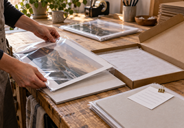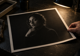


A print portfolio for gallery reviews should make the work easy to see, compare, and remember. It doesn't need to show every image you have made. It needs to present one clear group of work without making the reviewer sort through your whole archive.
Think of the portfolio as a short walk through the work. Choose the edit first. Then make the print size, paper, mounting, order, and notes support that edit. The printing should help the reviewer stay with the artwork.
Give the Print Portfolio for Gallery Reviews One Job
Decide what this meeting is for. A first gallery introduction, a review of a new series, and a conversation about a specific show are different jobs. Write the purpose in one sentence before choosing prints.
That sentence becomes the filter. If a piece doesn't help explain the series, the process, or the direction of the work, leave it out for this review. A strong print can still be wrong for this particular conversation.
Build a Focused Edit
Start with the pieces that carry the main idea. Lay them out where you can see the whole group. Look for repeated color, subject, scale, mood, or technique. The connection doesn't have to be obvious, but it should feel intentional.
Remove any print that needs a long apology or explanation. If two pieces do the same job, keep the stronger one. If the edit feels too even, add one image that changes the pace without breaking the group.
Review the set once from across the room and once up close. The first view shows whether the group holds together. The close view shows whether detail, paper, and print quality stay consistent.
Use One Main Print Size
One main size makes the work easier to compare. It also keeps the portfolio box, sleeves, and handling simple. Choose a size that lets the important detail read without making the set awkward to move through.
Use a second size only when scale is part of the point. A larger print should show something the smaller print can't. A different size should not be there only to make the portfolio feel more impressive.
Keep the Paper Choice Intentional
Choose the paper for the group, not one sheet at a time. The current giclee fine art prints include smooth, textured, matte, and baryta surfaces. A consistent surface helps separate real changes in the artwork from changes caused by the paper.
If the choice is close, compare the free media sample set in the same light you will use to review the prints. Add a second surface only when it clearly supports a different part of the work, such as fine line detail, deep blacks, or visible brush texture.
Decide Which Prints Need Structure
Loose prints are easy to update, reorder, and store. They also let a reviewer look closely at the paper edge and surface. Keep them clean and support them while they are being passed around.
Use mounted prints when a piece needs to stay flat, stand upright, or move between viewers without curling. Stackhouse mounts the selected print to 3/16-inch white foam board or black Gatorfoam. Mounting adds structure, so use it on purpose instead of treating it as an automatic upgrade.
Protect Prints That Will Be Handled Often
Gallery reviews can involve more handling than a framed print will ever see. Clean hands, support from below, and a cover sheet are still your first layer of protection.
For a review print that will be touched often, consider a protective spray made for inkjet fine art paper. These coatings can reduce fingerprints, light scratches, and surface wear. Don't use a general craft varnish. Paper coatings are different from varnishes made for canvas, and the wrong product may change the finish or damage the print.
Always test the spray on an extra print made with the same ink and paper. Let the ink dry fully before spraying. Follow the manufacturer's directions for application, drying, and safe handling. After it dries, compare the coated test with the untreated print under the same light. Keep an untreated approved print as your color and surface reference.
Put the Prints in a Useful Order
Open with a piece that introduces the work clearly. Don't save every strong image for the end. The middle should build the idea, change the pace, or show range. Finish with a piece that feels resolved and gives the conversation somewhere to go.
Test the order with another person. Ask them to move through the prints without your explanation. Watch where they pause, where two images feel repetitive, and where the sequence becomes confusing. Adjust the order before rewriting your whole statement.
Add a Simple Portfolio Index
Keep one plain index with the artwork title, image size, paper or surface, year, and availability. Add an edition note only when it applies. The index should help someone return to a piece after the review, not compete with the images while they are looking.
Put your name and contact information on the index or portfolio case, not across the front of every print. If a gallery asks for prices, dimensions, or edition details in another format, keep that separate so the physical review stays clean.
Save the Exact Print Recipe
Keep the approved file name, image size, paper, border, crop, and mounting choice with each piece. If the portfolio leads to a show, sale, or replacement request, you should be able to order the same result without guessing.
Check the set before every meeting. Confirm the order, count the prints, remove dust, and make sure corners and surfaces are clean. Replace a damaged review copy before it becomes the first thing someone notices.
Final Takeaway
A print portfolio for gallery reviews works best when the edit is focused and the physical choices stay quiet. Use one main size, one intentional paper direction, mounting only where it helps, a clear viewing order, and a simple index. Then save the exact print recipe so the work is ready for the next conversation.
FAQ
Should every print in a gallery portfolio be the same size?
No, but one main size makes the set easier to compare and handle. Include a different size only when scale is important to understanding the work.
Should portfolio prints be loose or mounted?
Either can work. Loose prints are easier to update and store. Mounted prints add structure for pieces that need to stand upright or move between viewers without curling.
Do I need a different paper for every body of work?
Usually no. Start with one surface that supports most of the work. Add a second only when it clearly helps a different group of images.
Can I use spray varnish on portfolio prints?
Use only a protective spray designed for inkjet fine art paper. Test it on an extra print first because a coating may affect the paper's color, texture, or sheen. Never test a new coating on your only finished print.