

Decide What Must Stay Visible Before Editing
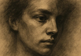
Learning how to print low key portraits starts with one question: Which dark boundaries explain the person? Darkness is part of the design. The print does not need detail in every fold, curl, or corner. It does need enough separation to show the face, expression, pose, and direction of light.
Before editing, identify the boundaries that carry that information. Mark where the face meets the hair. Check where the hair meets the backdrop. Look at hands against clothing and clothing against skin. Follow the outside edge of the pose. Also note any shadow gradient that shows the direction or softness of the light.
Then decide which areas may merge. A jacket sleeve might fade into a black backdrop if the hand and shoulder still explain the pose. The unlit side of the hair might disappear if the lit cheek and another edge define the head. A dark area becomes a problem when it removes information that the portrait needs.
Keep the Important Tonal Boundaries Readable
Judge each boundary by what it tells the viewer. The line between the face and hair often carries identity and expression. If dark hair and a shadowed cheek become one shape, the jaw or turn of the head may vanish. A narrow tonal step along the cheek may be enough. The entire face does not need to become brighter.
Hair against the backdrop explains the shape and angle of the head. That edge does not need to show every strand. One short area of separation near the crown or lit side may define the silhouette. The opposite edge can merge if the head remains clear.
Clothing needs separation where it explains anatomy. Imagine a subject wearing a black shirt with one arm folded across the body. If the shirt, sleeve, and torso print at the same tone, the pose may become one dark mass. A small step between the forearm and torso can restore the gesture. More shirt detail may not add useful information.
Hands often need careful review. A hand touching the face or resting near dark fabric may help explain the portrait. Keep enough difference to show its placement and basic shape. Fine skin texture matters less than the readable outline of the fingers, palm, or wrist.
Finally, inspect the outside of the pose. Part of a shoulder may disappear into the backdrop. If both shoulders, the hair, and the torso merge, however, the subject may look cut off by darkness. For more guidance on dark values and middle grays, see how to print black-and-white photos without muddy midtones.
Open Only the Dark Range That Needs Separation
Once you identify a weak boundary, adjust the tonal range that contains it. Avoid lifting every shadow at once. Curves maps original input tones to new output tones. The official GIMP Curves documentation explains that curve points and segments can change a selected tonal range in an active layer or selection.
Find the dark range that contains the important cheek, hair, sleeve, or hand. Place a point on that part of the curve and move it upward slightly. This maps those input values to lighter output values. Nearby points can restrain the change in adjacent ranges. Keep the deepest black in place when it supports the image.
Watch nearby dark values as you work. A broad lift can make deep shadows look gray. A steep curve can create an abrupt tonal change. A flatter curve compresses input tones into a smaller output range, which can reduce separation. Make small moves and compare the result with an untouched copy.
If the problem is confined to one area, you can apply Curves to a suitable selection. Check the edge at normal viewing size. Avoid a bright rim around the subject. The goal is a natural tonal step that still belongs to the original light.
Account for the Print's Black Limit and Surface
A screen and a paper print show darkness in different ways. The screen emits light. Paper reflects the light around it. A display that is too bright can make two close shadow tones look easier to separate than they will appear on paper.
Soft proofing can provide a useful preview when an appropriate soft-proof profile represents the output device. GIMP's black point compensation guide says the setting compensates for differences between the black levels available in the image profile and the output device profile represented by the soft-proof profile. Use this display as a preview aid rather than a substitute for a physical print.
The surface also changes how dark areas appear. Matte can support a soft, quiet portrait, but it may mute deep shadows compared with glossy finishes. Luster has a slight sheen and can retain rich blacks with portrait detail. Glossy and Metallic Glossy can give dark tones and highlights more force, although reflections may be more visible. FineArt Baryta offers depth, contrast, and subtle texture.
Review how to choose the best paper for your photo prints when comparing finish traits. Match the surface to the portrait's mood, required shadow separation, and expected viewing light.
Use a Test Print to Judge Relationships, Not Maximum Detail
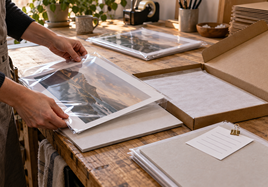
Print the image on the surface you plan to use. View it under neutral light or the light expected in its display space. Do not judge it beside a bright monitor, which can make the paper seem darker.
Check the relationships marked before editing. Can you read the face against the hair? Does enough hair separate from the backdrop? Are the hands clear against the clothing? Does the silhouette explain the pose? Check gradients for smooth changes. Do not search for detail that was meant to disappear.
A test print shows one image printed once on one selected surface. A comparison with another surface requires a separate test. If a boundary fails, revise one tonal cause at a time. This makes it easier to distinguish purposeful merging from blocked shadows or muddy transitions.
Final Takeaway
The key to how to print low key portraits is controlled darkness. Protect the tonal boundaries that explain identity, expression, pose, and form. Let less useful shadows merge. Make small adjustments to the needed range. Consider the surface and its black limit. Then judge a physical print under realistic light.
FAQ
These answers cover the main decisions behind a dark but readable portrait print.
Should every shadow contain visible detail in a low-key portrait print?
No. Solid or merged shadows can be intentional. Keep the tonal steps that explain the subject's face, shape, clothing, hands, or pose. Other dark areas may disappear when they do not carry needed visual information.
Why does a low-key portrait look more open on screen than in print?
A screen emits light, while paper reflects room light. An overly bright display can make close shadow values look easier to separate. Those same values may appear darker or closer together on paper.
How should I evaluate a test print of a low-key portrait?
View it under neutral light or the intended display light. Check the face, hair, clothing, hands, pose, gradients, and backdrop relationships you marked before editing. Order a separate test if you want to compare another surface.