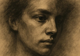


A black-and-white photo can look sharp on a bright screen and still print with heavy shadows or flat gray areas. The file may hold the full range, but the darker tones can sit too close together. Paper and viewing light can change the result too.
Professional Photo Prints can hold clean highlights, useful midtone steps, and deep blacks when the file and surface work together. The goal is not to make every dark area bright. It is to keep the details that give the photograph depth.
Start With a Neutral Black-and-White File
Open the full-size file, not a screenshot or a copy saved from social media. Look for a color tint in areas that should feel neutral. If a warm or cool tone is part of the photograph, keep it on purpose. If it is not, correct the cast before you judge the contrast.
Don't use one big contrast change as the first fix. That can make the black point darker while pushing the middle grays together. Work slowly and keep an untouched copy of the file so you can compare each change.
Turn Down an Overly Bright Screen
A screen makes its own light. Paper reflects the light in the room. If the screen is very bright, the image can seem more open than the print will look. Shadow texture may be easy to see on screen but hard to separate on paper.
Lower the display to a comfortable editing brightness and remove strong glare from the room. Then compare the darkest areas again. This is not a promise that the screen will match paper exactly. It is a way to stop the screen from hiding a problem.
Separate Shadows, Midtones, and Highlights
Read the photograph in three parts. In the shadows, check whether important hair, fabric, bark, clouds, or building detail stays distinct from solid black. In the midtones, make sure faces, skies, walls, and soft gradients don't merge into one dull gray band.
In the highlights, look for paper-white areas that have lost all texture. A bright highlight can be correct, but it should be a choice. Keep small steps between nearby tones when those steps explain shape, light, or distance.
A simple test is to look away, then return to the image at normal size. Can you still read the main subject before zooming in? If the center of the tonal range feels flat, adjust the midtones before pushing the black and white ends farther apart.
Check the File at the Real Print Size
Use the file prep guide to check pixel dimensions, crop, borders, and the embedded RGB profile at the size you plan to order. A file can look clean when it is small and show softness, noise, or editing halos when enlarged.
The current Professional Photo Prints page recommends a high-resolution JPEG or TIFF with an embedded RGB profile and notes that most prints are produced at 300 DPI.
Inspect the image at 100 percent. Check fine edges, grain, dust spots, and transitions around adjusted areas. Don't sharpen the whole file just to make one soft region look crisp. Extra sharpening can create bright outlines that become obvious in print.
Choose a Surface for Professional Photo Prints
The current Professional Photo Prints page offers Luster, Glossy, Metallic Glossy, and Photo Matt Fibre surfaces.
A matte surface can support a soft, quiet image with gentle transitions. Luster can balance detail with restrained sheen. Glossy or metallic glossy can make dark tones and bright highlights feel more forceful, but reflections may be more visible. None of these choices repairs a weak tonal file.
Review the current professional photo prints options, then choose the surface that supports the photograph instead of choosing only by habit.
Order One Print and Review It in Neutral Light
When close gray values matter, order one normal print before a larger run. Let the print sit under soft daylight or another neutral, steady light. Avoid judging it under one warm lamp or beside a bright screen.
Check the same shadow, midtone, and highlight areas you marked in the file. Also check the paper tone and surface reflection. Write down whether the issue comes from the file, the paper, or the room light before you make another edit.
The color correction guide explains which broad adjustments a printer may make and which image choices need to be settled in the submitted file.
Make One Tonal Change at a Time
If the first print is muddy, name the exact problem. Maybe two dark values need more space. Maybe the midtones need a small lift. Maybe the paper surface lowers the contrast you expected. Change one cause, save a new file version, and compare it with the first print.
Keep notes for the approved version: file name, print size, paper, border, and review date. That record is more useful than trying to remember which slider fixed the image months later.
Final Takeaway
To print black-and-white photos without muddy midtones, use an honest screen brightness, protect the steps between shadows and middle grays, and inspect the file at the final size. Then choose a paper surface that supports the photograph and review one result from Professional Photo Prints in neutral light before ordering more.
FAQ
Why do my black-and-white photo prints look muddy?
Muddy prints often begin with shadows and midtones that are too close together in the file. A very bright screen, a color cast, or the chosen paper surface can also change how those tones feel in print.
Which photo paper is best for black-and-white prints?
There is no single best surface. Matte paper can feel soft and quiet. Luster or glossy paper can give dark tones more snap. Compare the surface with the mood and detail in your photograph.
Should I order one print before a full black-and-white run?
Yes, when the image depends on close gray values, deep shadows, or a specific paper feel. Review one normal print in neutral light before ordering more.