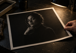


Why Deliberate Softness Can Resemble a Focusing Error
A soft photograph can feel calm, hazy, or dreamlike on a screen. Yet the same file may look like a focusing mistake on paper. This often happens because the print weakens the cues that guide the eye. When printing soft focus photography, softness is not the only issue. Visual order matters too.
A viewer needs some clue about where to look. That clue does not have to be a razor-sharp edge. It can be a face, a bright shape, a dark outline, or a patch of texture. If every part has the same weak detail and contrast, the softness may seem unplanned.
The Visual Anchors That Make Softness Look Intentional
A subject anchor is the feature that gives the eye a destination. It may be recognizable even when it is not sharp. Shape, light, color, texture, and composition can all create this anchor. Adobe's guide to emphasis in photography explains how these tools direct attention toward a focal point.
Imagine a soft portrait. The eyes may not show crisp lashes. Still, the eye sockets, catchlights, lips, and facial outline can hold more structure than the background. Those small differences tell us the softness belongs there.
Now picture a misty landscape. No leaf needs to be sharp. A dark tree line, a lone trunk, or a ridge against bright fog can anchor the scene. Leading lines may also guide the eye. The key is relative strength. One area must carry more visual weight than the rest, even if the whole photograph remains gentle.
Local Contrast Carries the Impression of Focus
Local contrast means the light-to-dark difference between nearby tones. It is not the same as making the whole image punchier. A small transition around an eye, branch, or horizon can feel more defined while the broad scene stays soft.
This matters because cameras can identify focused areas by finding strong contrast along edges and textures. Adobe's explanation of focus peaking describes this link between peak contrast and perceived focus.
If contrast, clarity, and edge separation are reduced everywhere, the image loses hierarchy. A better approach is selective. Protect a few useful transitions near the subject. Let less important areas dissolve. Do not add hard detail just to prove that the camera focused correctly. Preserve enough separation to show that the softness has direction.
Printing Soft Focus Photography at the Intended Scale
Print size changes what the eye can see. A digital file has fixed pixel dimensions. When that file is enlarged, those pixels spread across more inches. Its print resolution falls. Resolution here means the number of pixels used per printed inch, or PPI.
At a large size, a subtle facial edge or thin branch may become coarse. At a small size, delicate separation may compress into one tone. The Stackhouse guide to why print size matters for art reproductions explains the relationship between file dimensions, print size, and resolution.
Viewing distance changes the result again. The GIMP print-size guide notes that lower-resolution output can appear acceptable when it is seen from farther away. This is why a large wall print should not be judged only with your nose near the paper.
Preview the file at the planned dimensions. Then consider where a person will normally stand. Your anchor must survive at that scale and distance.
How Paper, Ink, and Room Light Reshape Soft Detail
The print surface can support or soften the remaining structure. Smooth paper tends to preserve clean edges, fine detail, and tonal precision. Textured paper scatters light across its grain and creates a softer, more organic appearance. The Stackhouse comparison of smooth and textured paper for art prints can help you compare those visible differences.
Texture is not automatically wrong for a soft image. Its grain may support the mood. The problem starts when that grain competes with the last useful edge, facial contour, or tonal break.
Paper and ink also affect dark detail. Dmax is a measure tied to the deepest printable black and detail in dark areas. Ink limits describe how much ink a medium can accept while keeping edges defined. Hahnemühle lists surface structure, Dmax, and ink limits among important paper quality factors.
Room light matters because paper reflects light while a screen makes its own light. A bright screen can make weak transitions look more open than they will on paper. Deep tones may also close up. Read more about why your art print looks different than your screen before treating every difference as a file problem.
A Pre-Print Test for Preserving Intentional Structure
Use this short test before approving the final print:
- Name the subject anchor. If you cannot name it, the hierarchy may be too weak.
- Find the strongest edges, textures, shapes, and tonal changes. Check whether they support the subject.
- Preview the planned dimensions and review the resulting print resolution.
- Judge the image from its expected display distance, not only from close range.
- Choose a smooth or textured surface based on whether it preserves or diffuses the key cues.
- Inspect a physical proof under realistic room light. Check the anchor, dark detail, and surface together.
If the proof fails, change only the cue that failed. You might lift one dark contour, protect one texture, reduce the size, or select a smoother surface. Avoid sharpening the entire frame when the real issue is one lost anchor.
Final Takeaway
When printing soft focus photography, intention survives through visual hierarchy. Preserve a recognizable anchor, a few useful contrasts, and enough texture for the chosen scale. Then judge the proof on its real surface, under real light, and from a normal viewing distance. Adjust the failing cue instead of removing the softness that gives the photograph its voice.
FAQ
Does a soft-focus photograph need one sharply focused area?
No. Conventional sharpness is not required. A focal point can come from stronger contrast, texture, shape, light, color, or selective detail. The important part is giving the viewer a clear place to look.
Can textured paper make a soft photograph look blurrier?
It can make the image appear softer because surface texture scatters light. Smooth paper generally preserves cleaner edges and tonal precision. Choose texture when its grain supports the image, not when it hides the remaining subject anchors.
Should a soft print be judged close up or from farther away?
Check it both ways. Close viewing can reveal coarse pixels, lost edges, or blocked shadows. Normal display distance shows how the whole image will read. Enlargement, resolution, and viewing distance all change how visible the detail appears.