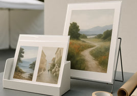


Fine art paper should support the artwork. It should not become another thing the artist has to fight. Most fine art paper mistakes happen before the file ever reaches the printer. The paper is chosen by name, the border is added late, or a large order is placed before anyone has held one finished print.
Start with the image and the way the print will be used. Then compare the real surface, paper tone, small details, crop, and final outside size. The paper and canvas guide can help narrow the choices, but the final decision should still come from the artwork in front of you.
Here are seven mistakes to avoid before ordering fine art paper prints.
Mistake 1: Choosing the Most Expensive-Sounding Paper
A premium name doesn't make a paper right for every image. A heavy textured sheet can feel beautiful in the hand and still compete with thin pen lines, tiny type, or sharp photographic detail. A very smooth sheet can hold those details well and still feel too clean for a loose watercolor or charcoal drawing.
Write down the two things the paper needs to do. Maybe it needs to keep a pale wash open and make the print feel soft. Maybe it needs to hold dark pencil marks without adding visible texture. That short list is more useful than starting with price or the paper name.
If two choices both sound good, don't treat the more expensive one as the automatic upgrade. The better paper is the one that carries the image clearly and feels right for the way the buyer will handle or display it.
Mistake 2: Ignoring the Smallest Important Marks
Look at the smallest detail that still matters to the piece. It may be a pencil line, a soft edge around a face, a thin branch, a signature, or a quiet change in a dark area. Paper texture can break up or soften those marks once the image is printed.
Zooming in on a screen is not enough. A screen shows light and pixels. It doesn't show what paper fibers will do to a tiny mark. Print the file at the real size, then view it from the distance a buyer will use. Step closer only after the full image feels right.
Choose smooth paper when the smallest marks need to stay crisp. Choose more texture when the physical surface adds something useful and the important details are large enough to hold. The goal is not maximum texture or maximum sharpness. The goal is a surface that fits the work.
Mistake 3: Forgetting That Paper Has Its Own Color
Paper is not an empty background. A bright white sheet can make cool colors and clean highlights feel more open. A warmer white can soften the image, but it can also warm pale backgrounds, skin tones, and light neutral colors.
This matters even when the image doesn't have a white border. Every printed color sits on that paper base. Very light areas may let more of the paper tone show through, so two papers can make the same file feel different without either print being wrong.
Place the paper sample beside the artwork under normal light. Look at the lightest area first. If the paper makes that area feel muddy, too warm, or too cold, try another surface before editing the file. Changing the file to fight the wrong paper can create a second problem later.
Mistake 4: Judging Texture From a Product Photo
Texture is hard to photograph. A product image may show the surface under strong side light so the texture is easy to see. In a normal room, that same paper may look quieter. The opposite can happen too. A surface that looks almost smooth online may feel very present when you hold it.
Use a real media sample set when surface feel is the open question. Tilt each sample toward a window or soft lamp. Look straight at it, then from a shallow angle. Run a clean fingertip along an unprinted edge if handling is allowed. Notice the texture, stiffness, white tone, and any reflection.
Make the comparison in the light where you work or show art. A paper chosen under one harsh lamp can be a surprise in soft daylight. The sample doesn't need to look dramatic. It needs to tell you how the surface will behave in your normal setting.
Mistake 5: Treating a Media Sample Like a Proof of Your Artwork
A paper sample and a custom test print answer different questions. The sample helps you compare paper. It can show texture, thickness, finish, and paper white. It can't show how your exact colors, shadows, crop, or small marks will print.
Once the paper choice is close, order one normal custom print of your artwork when the decision matters. Use that print as a review copy. This is especially useful for large sizes, pale color, deep shadows, skin tones, fine lines, tight crops, or an edition that needs to stay consistent.
Review the custom print as a whole. Don't hunt for tiny differences while holding it inches from your face. Check the color, detail, paper feel, crop, and border at a normal viewing distance. If one thing is wrong, name that one thing before changing the file or paper.
Mistake 6: Adding the Border After the Size Is Set
The image size and the outside paper size are not always the same. A white border adds paper around the image. If that extra space is not planned, the print may miss the frame, mat, sleeve, backing board, or shipping package you already picked.
Write down both measurements. First note the printed image size. Then note the finished outside size after the border is added. Check all four sides around signatures, faces, and important details. A border should feel intentional, not like spare paper that appeared at checkout.
Think about the next step too. An artist may want room to sign. A buyer may want to mat the print. A retail package may have a fixed outside size. Solve that physical fit before ordering so the print doesn't need to be trimmed or repackaged later.
Mistake 7: Ordering the Full Run Before One Print Is Approved
A large quantity makes a small decision expensive. The paper may be right while the crop is wrong. The color may be right while the border makes the sheet too large for the package. One custom print lets you check the full object before that problem becomes a stack.
Use the first print to test the real job. Put it in the sleeve or frame. Place it in the display bin. Look at it under daylight and normal indoor light. If it will ship flat, pack one copy. If it will be signed, confirm there is enough clean space for the signature.
When the print works, stop changing it. Keep that approved copy clean and separate from the inventory you sell. It becomes a useful reference for the next order, especially when the piece is part of an edition or returns after several months.
A 10-Minute Fine Art Paper Check
Before placing the order, take ten minutes and answer these questions:
- What is the smallest important detail in the artwork?
- Does the paper texture help that detail or get in its way?
- Does the paper white make the light colors feel right?
- Have you seen and held a real sample of the surface?
- Do you need one custom print to check your own file?
- What is the image size, and what is the final outside paper size?
- Does the border fit the signature, mat, frame, sleeve, or package?
- Have you checked the print under useful daylight and indoor light?
- Is the quantity small enough to catch a mistake without wasting a full run?
- Will you save the exact setup after approval?
If one answer is still fuzzy, solve that part first. You don't need to reopen every choice. A clear paper decision can stay simple: the artwork, the surface, the final size, and one finished print that proves the setup works.
Save the Exact Paper Recipe
After approval, save the file name, paper name, image size, outside size, border, crop notes, quantity, and order date. Add one sentence about why the paper worked. For example, note that the smooth surface kept the pencil lines clean or that the warmer sheet helped a quiet palette.
Keep the note with the approved print or in the same order folder. Don't rely on a thumbnail, memory, or a product name written months later. Those clues may not show the crop, border, or exact file version that made the print work.
That record makes the next order faster. It also makes a real change easier to spot. If a future print feels different, compare it with the approved copy before editing the file. The problem may be the viewing light, a different setup, or normal wear on the reference print.
Final Takeaway
Choose fine art paper by looking at the artwork, not the price or the name. Check the smallest detail, paper white, real texture, border, and final outside size. Use a media sample to choose the surface, then one custom print when you need to approve your own file. Once it works, save the recipe.
FAQ
Is fine art paper always matte?
No. Fine art papers can have smooth, textured, matte, or lightly reflective surfaces. Check the actual surface instead of relying on the fine art label alone.
How do I choose between smooth and textured fine art paper?
Look at the smallest important marks in the artwork. Smooth paper usually keeps fine lines crisp, while texture can add a physical feel but may soften tiny detail.
Is a media sample enough before a full print run?
A media sample helps you choose a paper. One custom print of your artwork checks the actual color, crop, border, and detail before a larger order.