

Softness Needs a Tonal and Edge Hierarchy
Softness works when the eye can tell that it was chosen. In charcoal art prints, a firm contour, dark accent, or patch of grain can guide the eye. Nearby blended marks can then stay quiet. This creates an edge hierarchy. Some edges lead. Others support.
Local contrast is the light-to-dark difference between nearby tones. It is not the same as raising contrast across the whole image. A small value change around an eye can add focus without making every shadow harsh. The same principle explains why can a soft-focus photograph look accidental in print? Strong focal cues let gentle areas look deliberate rather than unclear.
Capture the Differences Before They Collapse
A print file cannot restore distinctions that were never captured. Keep the camera stable, centered, and square to the drawing. If you scan the art, flatten the sheet without crushing raised charcoal. Use even light and accurate focus. Uneven light can make one side of the paper look gray while the other looks washed out.
Capture enough resolution for the planned print size. Fine strokes, faint dust, blended shading, and bare paper should remain separate when you inspect the image at 100 percent. RAW or TIFF files retain more editing room than a heavily compressed file. Turn off automatic camera or scanner sharpening. The GIMP Sharpen filter guide advises disabling device sharpening so that the effect can be controlled during editing.
For a broader setup guide, see how to digitize your artwork for professional printing. Compare the capture with the original before making strong edits. Confirm that the hardest marks remain distinct from the soft passages.
Keep the Drawing Paper Inside the Value Structure
Untouched paper forms the light end of a charcoal drawing. It may be white, cream, warm, cool, or lightly textured. That tone affects how faint charcoal becomes visible. If the background is forced to pure white, pale dust and rubbed edges may disappear. The drawing can then lose depth even while looking brighter.
Start with restrained white balance. White balance can correct an unwanted color cast from the capture light. Then adjust exposure and Levels while watching bare paper, faint charcoal, and dark accents together. The GIMP Levels documentation explains that the white point turns values at or above the selected level white. An aggressive setting can merge light marks with the sheet.
Correct a false cast, but keep an intentional paper shade. Compare the edited file with the original under neutral light. If a pale edge vanishes, pull back the exposure or white-point change before adding contrast elsewhere.
Use Local Contrast to Guide the Eye
First, name the focal area. Then find the few edges and value changes that make it readable. Give those cues enough separation to survive reproduction. Let secondary forms remain gradual. This keeps the drawing clear without turning soft charcoal into hard, graphite-like lines.
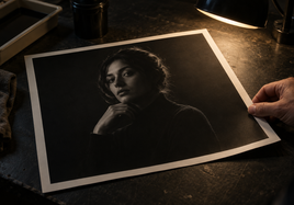
Imagine a hypothetical charcoal portrait. The upper eyelid, pupil, and corner of the mouth might hold firmer marks. Hair, cheek shadow, and background dust could stay blended. Raising global contrast would deepen all of them. A local adjustment could protect the face while leaving the surrounding softness intact.
In a hypothetical figure drawing, one shoulder contour might define the pose. The limbs may be modeled with broad, rubbed tones. Keep the shoulder decisive. Do not force every soft limb edge into a dark outline. Ask whether each stronger mark supports the subject. If it does not, it may compete with the intended focal point.
Sharpen Charcoal Art Prints at Final Output Size
Digitizing and printing can soften small edges. Output sharpening restores some edge contrast after the file reaches its final pixel dimensions. Judge it at the planned print size and resolution. A setting that looks mild in a large master file may look too strong after resizing.
In an unsharp mask, radius controls how many pixels around an edge are affected. Amount controls the strength of the effect. Threshold sets the minimum tonal difference that counts as an edge. A suitable threshold can protect smooth shading while allowing stronger marks to sharpen.
Avoid one strong setting across the full drawing. Too much radius or amount can create light or dark halos beside contours. It can harden blended charcoal and bring paper grain forward. If your software allows it, apply sharpening on a separate layer or output copy. Inspect the focal marks, broad shading, and bare sheet at 100 percent. Then view the whole image at its intended size.
Match the Print Surface to the Remaining Edge Cues
The print paper becomes part of the result. Brightness describes blue-light reflectance at a set wavelength. Whiteness describes reflected light across the visible range. They are related, but they are not the same. Datacolor’s guide to paper brightness also explains that shade, texture, surface structure, and optical brighteners affect paper appearance.
A brighter or smoother sheet may give delicate charcoal more visible separation. A textured surface can add its own pattern and soften small edge cues. Neither choice is always correct. Match the surface to the marks that must remain visible. Also compare its shade with the captured drawing paper. A cool print sheet may change the feel of an original made on warm cream stock.
Judge a physical proof first at normal display distance. Then move closer. Check it under neutral light and under the expected display light. Optical brighteners respond to ultraviolet light, so a paper can change in appearance as the light source changes.
Final Takeaway
Clear charcoal art prints keep the drawing’s original order. Retain crisp marks where they establish focus. Protect soft transitions in supporting areas. Keep the intended tone of untouched paper. Then inspect a physical proof. If one cue fails, revise that cue alone. Do not sharpen or raise contrast everywhere, since that removes the difference between decisive marks and quiet passages.
FAQ
These answers cover sharpness, paper tone, and proof evaluation for charcoal reproduction.
Should every charcoal edge be sharpened for reproduction?
No. Sharpening every edge removes the planned difference between crisp marks and blended passages. Sharpen at final resolution. Use threshold or selective treatment to protect smooth tonal transitions while strengthening the few edges that guide the eye.
Should untouched drawing paper be edited to pure white?
No, not when the original sheet has an intentional warm, cool, cream, or textured look. A strong white-point adjustment can erase faint charcoal and change the drawing’s value relationships. Correct unwanted casts while preserving the sheet’s role in the image.
How should a charcoal proof be checked for haze?
View it first at normal display distance and then close up. Use neutral light and the expected display light. Check that focal marks remain distinct, soft transitions stay gradual, and the reproduced paper tone remains separate from the lightest charcoal.