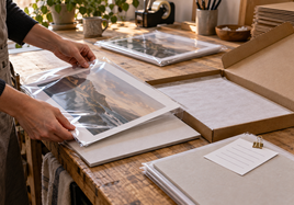


If you are choosing between color-accurate art reproduction and standard prints, start with the actual job the print has to do. A painting reproduction, a signed edition, and a simple photo gift do not need the same print path.
Here is the plain version: use the color-accurate reproduction path when the artwork needs careful paper choice, proofing, soft color, texture, or edition consistency. Use a standard print path when the file is straightforward, the buyer wants an easy-to-frame print, and the surface does not need to carry extra value.
What Stackhouse Means by the Two Paths
At Stackhouse, color-accurate art reproduction usually points toward a more careful fine art workflow. That often means starting with Giclee Fine Art Prints, checking the file at the real size, choosing the paper for the artwork, and using a proof or sample when color or surface feel matters.
A standard print path is simpler. For many photographs, digital pieces, gifts, portfolio prints, or everyday open-edition items, Professional Photo Prints can be the cleaner starting point. The goal is still a good print. It just does not need the same amount of paper testing or edition control.
Neither path is automatically better. The better path is the one that supports this artwork, this buyer, and this order.
Color-Accurate Art Reproduction vs. Standard Prints: Quick Decision Table
| If the print needs... | Start with... | Why |
|---|---|---|
| Soft color, paper texture, edition consistency, or a more art-object feel | Color-accurate fine art reproduction | The paper and proofing choices become part of the value. |
| Crisp photo detail, a familiar finish, or an easy gift/framing path | Standard photo prints | The buyer understands the format quickly and the order stays simpler. |
| A signed or numbered release | Color-accurate reproduction | You need a repeatable recipe for paper, crop, color, and border. |
| A lower-risk first run for a broad audience | Standard prints | It is easier to price, explain, frame, and reorder. |
Use the table as a starting point, not a rulebook. The same artist may use both paths for different pieces.
Start With the Artwork, Not the Product Name
Look at the image before choosing the product. Does the artwork depend on pale washes, subtle shadows, brush texture, skin tone, deep blacks, or tiny line work? Those details decide how careful the print path needs to be.
If the surface is part of the experience, slow down. A textured fine art paper can make a reproduction feel closer to the original object. A smooth or photo-style surface can keep detail and contrast more direct. The right answer depends on what the image needs to hold.
If the file, crop, or color setup is still uncertain, use File Prep for Printing before placing the order. For most orders, Stackhouse asks for a high-resolution RGB file with an embedded color profile. That one step removes a lot of avoidable guesswork.
Choose the Paper Path on Purpose
For paintings, drawings, mixed media, and illustration work, the fine art path gives you more room to choose by feel. Matte, smooth, textured, and baryta-style papers can all change how the same image reads in person.
For photography and everyday image prints, the photo print path may be easier to explain. Luster, glossy, metallic glossy, and matte-fibre style choices are familiar to many buyers. They can work well when the image needs clean detail, contrast, or a polished photographic finish.
If paper choice is the real question, do not decide from a screen alone. Use the paper and canvas guide to compare how surface, texture, glare, and display plans change the finished piece.
When Color-Accurate Reproduction Is Worth It
Choose the more careful reproduction path when color, texture, or consistency will affect the sale. This is common for limited editions, collector orders, watercolor reproductions, soft graphite or pastel work, and pieces where the paper feel is part of the buyer experience.
This path is also useful when you need a print recipe you can repeat. Save the file name, print size, crop, border, paper, proof notes, and packaging plan. If the piece sells again, that recipe keeps the second batch from drifting away from the approved version.
It may cost more time up front, but it makes sense when the finished print needs to feel intentional in person.
When Standard Prints Are the Better Choice
Choose the standard print path when the file is ready, the buyer wants something familiar, and the print does not need a special fine art surface to make sense.
This can be smart for photo gifts, portfolio pieces, small open-edition prints, event inventory, and images where clean detail matters more than paper character. A simpler print can also be easier to price, frame, pack, and reorder.
The key is not to undersell the work. It is to avoid adding complexity that the buyer cannot see, feel, or value.
Test Both Options With the Same Image
If the choice is close, compare the same image at the same size. Do not compare one artwork as a giclee print and a different artwork as a photo print. The image itself will confuse the decision.
Put the samples under normal room light. Check shadows, pale color, skin tone, texture, edge detail, glare, and paper white. Then step back and ask which print you would feel comfortable handing to a buyer.
A proof is especially useful when the artwork is color-sensitive or when the print will become part of a larger edition. A sample is useful when the main question is paper feel.
Price the Finished Piece, Not Just the Print
The cheaper print is not always the better business choice. The more expensive print is not automatically more professional either.
Add the print, proofing, sleeve, backing board, mailer, replacement risk, fees, and your time. Then ask whether the finished piece can support that price in your shop, at a fair, or with collectors.
A fine art reproduction can support a stronger price when buyers can see the paper, color, and presentation difference. A standard print can be smarter when it keeps the order easy to buy and easy to explain.
Make the Buyer Choice Simple
Buyers do not need every production detail. They need to know what the print feels like, how it will arrive, and what they need to do after they get it.
If you offer both paths, give each one a clear role. For example, the fine art version can be the premium signed edition, while the standard print stays the accessible open-edition option. That is easier to understand than a long menu of nearly identical choices.
Use product photos that show scale, paper surface, and packaging. A clear photo often answers more questions than another paragraph of print language.
Save the Approved Recipe
Once the print looks right, write down the setup. Include the file name, final image size, outside print size, paper, border, crop notes, quantity, and packaging plan.
Keep one approved proof or sample if consistency matters. A real print is a better reference than memory, especially when you reorder months later.
This is the simplest way to protect color-accurate reproduction work. It also helps standard print reorders stay clean and predictable.
What to Send Before the Full Order
Before you order a larger run, gather the details that help Stackhouse check the job quickly. Send the final file, the planned print size, whether you want a border, and the way the piece will be sold or displayed. If color is sensitive, mention what must stay true: pale washes, skin tone, deep blacks, soft pencil marks, or a specific paper feel.
For a standard print order, the main checks are usually file size, crop, surface, and quantity. For color-accurate reproduction, add the approved proof, paper choice, edition notes, and any reference print you want future batches to match.
This does not need to be complicated. A short order note can say, "8x10 image on fine art paper, 1-inch border, keep the blue shadows soft, planning a signed edition of 25." That gives production a clearer target than a file alone. It also gives you a record to use when the same piece sells again.
If you are not sure which path fits, say that too. A clear question before the order is easier to solve than a print that arrives close but not quite right.
Final Takeaway
Choose color-accurate art reproduction when the artwork needs careful paper choice, proofing, and a repeatable print recipe. Choose standard prints when the image is straightforward, the buyer wants a familiar format, and the order should stay simple.
The best choice is the one you can explain, price, pack, deliver, and reorder with confidence.
FAQ
Are color-accurate art reproductions always better than standard prints?
No. They are better when paper feel, color control, proofing, or edition consistency matter. Standard prints can be better when the image and buyer need a simpler format.
Should I order a proof before choosing?
Order a proof when color, crop, border, texture, or edition consistency could change the final result. If the main question is only paper feel, start with samples.
What should I save for future reorders?
Save the file name, size, crop, border, paper or print surface, proof notes, quantity, and packaging plan. Keep an approved sample when consistency matters.