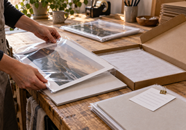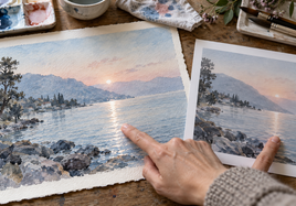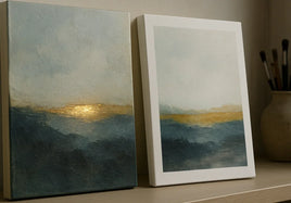


When your giclee print arrives, don't judge it only against the file on your screen. Hold it in real light and check the paper, color, crop, borders, and fine detail. This giclee print checklist walks you through that review before you order more.
There are two different tools for this job. A free media sample set lets you compare blank or preprinted paper surfaces. One custom giclee print lets you inspect your own artwork at the size, crop, and border you selected. They answer different questions, and you may need one or both.
Start With the Right Sample for Giclee Fine Art Prints
Use the free media sample set when you are still choosing paper. It helps you compare texture, finish, weight, and white point in your own studio light. It doesn't show how your exact file will print.
Order one custom giclee fine art print when you need to check your artwork. This test copy can show whether color, shadows, crop, borders, and small details feel right before you order more. It is a normal custom print used as a review copy, not a separate formal proofing service.
If paper is the only open question, start with the media sample set. If the artwork itself is color-sensitive, tightly cropped, large, or part of an edition, one custom print is the better check.
Check Giclee Paper Texture, Finish, and White Point
Hold the paper instead of judging it from a product photo. Tilt it toward a window or a soft lamp. A smooth surface can keep fine lines crisp. A textured surface can add depth to paintings and drawings, but heavy texture may soften very small marks.
Current Stackhouse giclee paper choices include Hot Press Bright, Cold Press Bright, Photo Rag, William Turner, and FineArt Baryta. The names are useful, but the paper in your hand is a better guide than the name alone.
Also look at the paper white. A bright white can make cool colors feel clean and crisp. A warmer white can make soft color feel calm, but it may shift pale backgrounds or skin tones. Choose the surface that supports the artwork instead of the one that sounds most premium.
Check Print Color in Neutral Daylight
A screen makes light. Paper reflects the light in the room. That's why a print may look darker or less bright than the same image on a phone or monitor.
Check the print near neutral daylight, but keep it out of harsh direct sun. Then look again under the light where the artwork will normally be viewed. Warm bulbs can make whites and skin tones look warmer. Very cool lights can make the same print feel blue.
Turn your screen brightness down before comparing. Give your eyes a minute to adjust. Don't edit the file after one quick look under poor light. First decide whether the difference comes from the paper, the room light, or the file itself.
Inspect Shadows, Highlights, Gradients, and Fine Detail
Start with the darkest part of the image. Can you still see the detail that matters, or have several dark tones blended into one heavy area? Then check pale highlights. Make sure a light wash, cloud, dress, or white object still has shape instead of fading into the paper.
Look closely at soft gradients such as skies, studio backdrops, and smooth color fields. They should change cleanly without obvious bands. Check hair, pencil lines, brush texture, fabric, and other fine detail at normal viewing distance, then look closer only when needed.
The goal is not to make every tiny pixel visible. The goal is to keep the detail that gives the artwork its character at the finished print size.
Confirm Crop, Border, and Finished Dimensions
Set the print on a clean flat surface and check all four edges. Make sure faces, signatures, horizon lines, and quiet areas are not crowded by the crop. If the piece has a border, compare the visible border on every side.
Current giclee choices include borderless, 1/4-inch, 1-inch, and 2-inch borders. Borders add to the outside print dimensions, so the image size and the final sheet size are not always the same.
Use the file prep guide to review resolution, color profile, crop, border, and output size. Measure the finished sheet when exact outside dimensions matter for a mat, frame, sleeve, or edition record.
Record the Exact Approved Print Setup
Write down the file name and version, paper, image size, border choice, and finished outside dimensions. Add the order number and date. If you made a file change after the test, give the revised file a new name so the approved version is clear.
Keep the test copy clean if it will be your reference. Store it flat and protected from strong light, moisture, and handling. A real reference is useful when you reorder, but it works only if you can match it to the exact file and settings.
You don't need a complicated production system. One plain note tied to the approved print is enough for most artists and photographers.
When One Test Copy Is Worth the Cost
One custom test print is worth it when a mistake would cost more than the check. That often includes a large print, an important edition, subtle skin tones, deep shadows, pale watercolor, a tight crop, a signature near the edge, or a new paper you have not used with that image.
You can usually skip another test when you are reordering the same approved file, paper, image size, border, and quantity. If any of those details changed, treat it as a new setup and decide whether one fresh print would lower the risk.
Packaging is a final quick check, not the main purpose of this review. Make sure the approved sheet fits the sleeve, mat, frame, or mailer you plan to use, then keep the focus on the print itself.
Final Takeaway
Use a media sample set to choose the paper. Use one custom giclee fine art print to check your artwork. Review giclee fine art prints for paper texture, white point, color, shadows, highlights, fine detail, crop, borders, and finished dimensions in real light. Once the print looks right, save the exact setup so the next order can match it.
FAQ
Is the free media sample set a proof of my artwork?
No. The free media sample set helps you compare paper surfaces, texture, finish, and white point. It is not printed with your custom artwork.
When should I order one giclee test print?
Order one custom print when color, crop, borders, shadow detail, or final size could change whether the finished piece feels right.
What should I save after I approve the print?
Save the exact file name, paper, image size, border choice, outside dimensions, and order details. Keep the approved print as a visual reference when consistency matters.