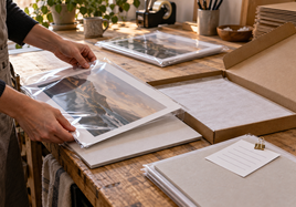


Archival pigment printing is a strong fit when the finished print needs to feel like a real art object, not just a quick copy. It can help paintings, drawings, mixed media, digital art, and photo-based work hold color, detail, and a premium paper feel.
Here is the short version: check the artwork, paper, final size, color, border, proofing plan, and reorder notes before you place the full order. Those choices matter more than the printer phrase by itself.
Archival Pigment Printing Starts With the Artwork
Start by looking at the image, not the product name. A soft watercolor, a graphite drawing, a high-contrast photo, and a colorful digital illustration can all need different surfaces. The right print path should support the artwork instead of forcing every file into the same finish.
Ask what the piece needs to keep. Maybe it needs soft paper texture. Maybe it needs tiny line detail. Maybe the dark areas need to stay open instead of turning heavy. Name those needs first, then choose the surface.
For many art reproductions, giclee fine art prints are the practical Stackhouse starting point because they are built around fine art papers, custom sizing, and art-focused file review.
1. Choose the Paper for the Image
Paper is not just a background. It changes how ink, color, detail, and contrast feel in person. A smooth paper can keep small lines sharp. A textured paper can make a painting or drawing feel softer and more tactile. A glossy fine art surface can add depth, but it may not fit every image.
The current fine art paper options include Hot Press Bright, Cold Press Bright, Photo Rag, William Turner, and FineArt Baryta. That gives you smooth, lightly textured, soft matte, heavily textured, and baryta-style choices to compare.
Stackhouse's paper and canvas guide is useful when you are choosing by surface feel, paper tone, and presentation instead of guessing from names alone.
2. Check the File at the Final Size
A file can look clean on a laptop and still struggle at print size. Before ordering, view the file close to the final dimensions. Look at small details, edges, signatures, shadows, pale washes, and any marks that should stay quiet.
Use a high-resolution JPEG or TIFF with an embedded RGB profile. Then check whether the file still looks strong at the size you plan to sell.
The print sizes, borders, and cropping guide can help you review aspect ratio, crop, border space, and output size before the file becomes a finished print.
3. Decide What the Border Needs to Do
Borders affect more than looks. A border can leave room for signing, make matting easier, protect quiet edge detail, or help a print feel more finished in a sleeve. A borderless print can feel clean and direct, but it gives you less room for handling and framing decisions.
The current fine art print border choices include borderless, 1/4-inch, 1-inch, and 2-inch borders, with borders adding to the final outside print dimensions.
Don't wait until the end to think about this. Crop and border work together. If a signature, face, horizon line, or quiet edge sits too close to the trim, the print may feel tense even when the image quality is good.
4. Match Color Expectations to Paper
A screen glows, but paper reflects light. That one difference can make a print feel darker, softer, warmer, or less bright than the file. Archival pigment printing can hold subtle color, but the paper still shapes the final look.
Check the image for deep shadows, pale colors, skin tones, blue skies, and large flat areas. Those are the places where print surprises show up first. If one area matters most, make that area the main proofing target.
This is also where paper tone matters. A warmer paper can soften whites. A brighter paper can make color feel cleaner. A textured sheet can change how tiny detail reads. None of that's bad. It just needs to match the piece.
5. Use a Proof When the Risk Is Real
A proof is worth it when the order is large, the color is sensitive, the size is new, or the edition needs to stay consistent. It gives you one real print to judge before the full run exists.
Use the proof like a checklist. Look at the file size, color, crop, border, surface, and handling. If one thing feels wrong, fix that one thing and test again if needed. Changing everything at once makes it harder to know what helped.
Proofing is especially useful for soft watercolor, graphite, dark photography, limited editions, and work that buyers will inspect up close. A small check can protect the whole edition.
6. Plan How the Buyer Will Receive It
The print doesn't stop being important after it leaves the printer. It has to be sleeved, packed, framed, stored, shipped, displayed, or handed across a table. The surface and size should make those steps easier.
Think about the normal sale. Will the buyer browse the print in a bin? Will it ship flat? Will it go into a standard frame? Will you sign it first? Will a gallery or collector expect a consistent edition? Those answers can change the best size, border, and paper.
If you sell at art fairs, keep one handled display copy separate from the clean sellable stock when possible. If you sell online, photograph the finished print in a way that shows scale and paper feel without overcomplicating the listing.
7. Save the Print Recipe
Once the print looks right, save the recipe. Write down the file name, print size, outside dimensions, paper, border, crop notes, proof approval date, quantity, and packaging plan.
This is not busywork. It keeps reorders from drifting. It also helps you answer buyer questions with confidence. When a print sells out, you can reorder the approved setup instead of rebuilding the whole order from memory.
Keep one approved print if edition consistency matters. A physical reference is easier to trust than a bright screen or a vague note from months ago.
Archival Pigment Printing Order Checklist
Before you order, make sure these answers are clear:
- What does the artwork need to keep: texture, fine lines, deep blacks, soft color, or low glare?
- Which paper best supports that need?
- What is the final image size and final outside print size?
- Does the crop protect important edges, signatures, and quiet space?
- Does the border help with signing, matting, framing, or handling?
- Is the file high enough resolution at the actual print size?
- Do you need a proof before the full run?
- Have you saved the approved setup for reorders?
If one answer is still fuzzy, solve that part first. A simple order with clear choices is easier to review than a complicated order built on guesses.
Match the Print to the Job
Start by asking what archival pigment printing needs to do. A print for a bin at an art fair has a different job than a print going straight into a frame. A proof for your own studio has a different job than an edition you plan to reorder all year.
This sounds simple, but it helps. When the job is clear, the paper, size, border, crop, and packaging choices become easier. You are not trying to pick the fanciest option. You are trying to pick the option that makes the work feel finished and easy to sell.
Think About the Buyer Experience
Most buyers are not thinking like printers. They are looking at the image, the feel of the paper, the size, and whether the piece feels worth taking home. Small production choices can make that decision easier.
A clean border can make a print feel calmer. A paper with texture can make a reproduction feel more like an art object. A smooth surface can help a photograph keep detail. The best choice is the one that supports the artwork without calling too much attention to itself.
Check the File at the Real Size
Don't judge the file only while it is zoomed out on a screen. Look at it at the final print size, or as close as you can. Check the corners, signature, border, shadows, and any fine lines. Those are the details that tend to surprise people later.
If the image will be printed large, tiny problems can become easier to see. If the image will be printed small, important details can get lost. The goal is not to make the file perfect in the abstract. The goal is to make it work at the size people will actually receive.
Final Takeaway
Archival pigment printing works best when the print plan is specific. Start with the artwork, choose the paper for the image, check the file at the final size, set the crop and border, proof when the risk is real, and save the approved recipe before you reorder.
FAQ
Is archival pigment printing better for artists or photographers?
It can work for both. The better question is what the image needs, how the print will be sold, and how you want it to feel in person.
What should I check before ordering archival pigment printing?
Check the final size, crop, border, resolution, color, and paper choice. If the order is large or color-sensitive, order a proof first.
Should I order a sample before producing a full edition?
Yes, if the paper, color, border, or packaging will affect how people see the work. A small test can save a lot of stress later.