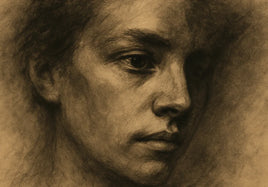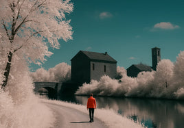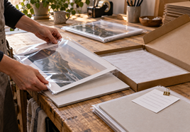


Finished giclee fine art prints can look different as the light changes. Daylight may feel cool and clear. A lamp may make the paper look warmer. Mixed light can flatten shadows or change colors. That doesn't always mean the file or print is wrong.
Here is the short version: check giclee fine art prints in different lighting before you edit the file or order the next batch. Start with soft daylight. Move to normal room light. Then check the shadows, paper white, skin tones, and pale colors. For display setup, see the practical art print lighting guide for fixtures, CRI, angles, and color temperature.
Start With Soft Daylight for Giclee Fine Art Prints
Soft daylight gives you a useful first look because it makes it easier to see the paper, color, and fine detail without a strong yellow or blue cast. A bright window can work, but keep the print out of direct sun. Direct sun creates hard glare and makes the test harder to trust.
Hold the print upright or place it on a clean neutral surface. Give your eyes a minute to settle. Look at the whole image first. Then move closer and check details. The first question is simple: does the print feel balanced before you start looking for tiny problems?
Move to the Room Light Buyers Will Use
Next, take the same print into a normal room. Use the light that's already there. A warm lamp can make the paper and light colors feel creamier. Cooler bulbs can make the same print feel cleaner or slightly blue. Neither view is the only true version.
Think about where buyers may see the work. A home, gallery, booth, and studio can all have different light. You don't need the print to look identical in every room. You need it to keep the mood, detail, and important color relationships under the light people really use.
Check Mixed Light Too
Mixed light is common. A room may have window light on one side and warm bulbs overhead. An art fair booth may have daylight outside the tent and cooler light under the canopy. Mixed light can create a color shift across the surface, especially on a larger print.
Turn the print or move it a few feet. If the color shift moves with the light, the room is causing most of what you see. If the same area stays too dark, too red, or too flat everywhere, the file or proof may need a closer look.
Watch the Paper White
Paper is part of the color. A bright white paper and a warmer natural paper won't hold pale colors in the same way. Warm light can make a natural paper feel even warmer. Cool daylight can make a bright white sheet look more open and crisp.
Look at blank border space when the print has one. The border gives your eyes a quick reference for the paper tone. Then look back at whites, light gray, soft blue, and skin tones inside the image. This helps you separate the paper choice from the ink color.
Look at Shadows and Dark Color
Dark artwork needs a slow check. A screen can show detail in deep shadows because it makes its own light. Paper only reflects the light in the room. Under dim or warm light, dark areas may close up faster than you expected.
Look for texture, brush marks, folds, hair, or background detail that should still be visible. Don't brighten the whole file just because one dim room hides those details. Check the print under soft daylight again. If the shadows stay blocked in more than one normal light, make a small adjustment and order another proof.
Check Pale Colors and Skin Tones
Pale washes and skin tones can change quickly under warm bulbs. Cream, peach, pink, and light gray may pick up the color of the room. A print with soft color can still be correct even when it feels warmer at night than it does near a window.
Compare color relationships instead of chasing one exact screen match. Ask whether the skin still feels natural, whether pale colors stay separate, and whether one area suddenly pulls too much attention. Those checks are more useful than expecting every light source to produce the same view.
Check Glare Before You Judge Color
Glare can make a color problem look worse than it is. A shiny spot may wash out dark color, hide paper texture, or make one side of the image look lighter. Tilt the print a little or move the lamp before deciding the ink or file is wrong.
Surface matters here. Matte and textured papers usually spread reflections. Smoother or glossier surfaces can show a brighter reflection from a window or bulb. Look at the print straight on, then from the normal viewing angle. Make sure you are judging the artwork instead of a reflection sitting on top of it.
Change the File Only When the Problem Stays
Don't edit the file after one odd lighting check. First move the print. Try another room. Return to soft daylight. If the problem disappears, the light was the main cause. If it stays, write down the exact issue before opening the file.
Make one change at a time. Adjust a shadow, color cast, or pale area, then order a proof. Keep the first proof beside the new one. A side-by-side check under the same light makes a small improvement easier to see and keeps the correction from creating a new problem.
Use a Simple Review Routine
A repeatable check keeps the review from turning into guesswork. Start in soft daylight. Check the paper white, main colors, shadows, and fine detail. Move to normal room light and check the same four things. Add mixed display light when the print will be sold at a fair or shown in a gallery.
Write down what changed and what stayed stable. Save the file name, paper, size, border, proof date, and the light used for approval. Keep one clean approved print as a reference when consistency matters. That record will help when the piece needs another run months later.
For file or proofing help, use the file prep guide before ordering.
Final Takeaway
Check giclee fine art prints in soft daylight, normal room light, and the mixed light it may meet on display. Watch the paper white, shadows, skin tones, and pale colors. Change the file only when the same issue stays visible under more than one useful light source.
Order giclee fine art prints here.
FAQ
What is the best light for checking an art print?
Start with soft daylight that's not hitting the print directly. Then check the same print under the normal indoor light where it may be viewed.
Why does an art print look warmer under indoor light?
Many room bulbs are warmer than daylight. That warm light can make whites, creams, reds, and skin tones feel more yellow or red.
Should I change the file for one room's lighting?
Usually no. First check the print under more than one normal light source. Change the file only when the same problem stays visible and a proof confirms it.