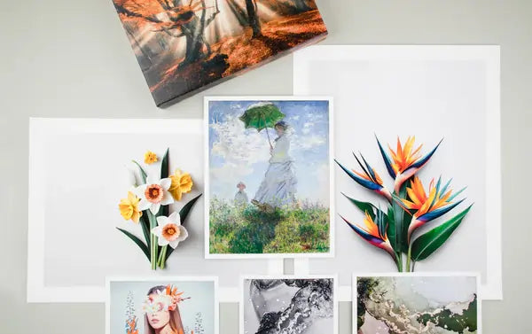
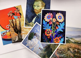
If you have reached the point where you are ready to select the perfect paper for your watercolor prints, you have already come a long way. From creating the original artwork to deciding to sell prints, through carefully digitizing your artwork, and now researching the best printing materials, the process can feel like a lot to manage.
The Stackhouse Printery created this guide to make your next step simple and confident. Below you will find clear recommendations for the best papers for printing watercolor artwork, with quick comparisons, testing tips, and links to helpful resources.
Why Paper Choice Matters for Watercolor Prints
Paper is the foundation of a great print. The surface you choose influences color, contrast, detail, and the tactile feel of the final piece. Watercolor paintings rely on visible paper grain and thickness to express the medium’s character. That same beauty can be replicated through giclee printing, which uses archival inks and fine-art papers designed to mimic traditional watercolor stocks.
With the right paper, soft gradients, delicate brushwork, and transparent washes are preserved. The wrong surface can mute color and flatten the look of the original.
Qualities to Look for in a Watercolor Print Paper
Use this quick table to evaluate candidates:
| Quality | What It Means | Why It Matters |
|---|---|---|
| Texture | Surface pattern such as smooth, lightly textured, or rough | Adds dimension and replicates the feel of watercolor paper |
| Paper Weight (GSM) | Thickness or density of the sheet | Heavier stocks resist curl and feel closer to an original |
| Whiteness | Base tone of the sheet from natural to bright white | Bright bases make colors pop and keep highlights clean |
| Color Gamut | Ability to reproduce vivid, accurate color | Ensures your file prints as intended with smooth transitions |
All Stackhouse papers are printed using Epson UltraChrome PRO12 inks for a wide color range and excellent longevity. Our color-corrected workflow helps the printed result match your original artwork.
Matte Paper vs Gloss Paper
Most watercolor reproductions look best on matte papers due to texture and a non-reflective finish. Some artists like the added contrast of gloss or luster. Here is a quick comparison:
| Finish | Best For | Look and Feel |
|---|---|---|
| Matte Papers | Watercolor, ink, gouache, pencil, mixed media | Subtle sheen, textured surface, soft appearance |
| Gloss or Luster Papers | Photography or watercolor-inspired digital art with high contrast | Smooth surface, richer blacks, enhanced perceived sharpness |
If you want a touch of gloss, consider Luster Photo Paper or try a textured sheen with Satin Canvas.
Why Proofing and Testing Matter
- Order a small print, such as 8 × 10 inches, to evaluate detail and tone.
- Compare surface textures under neutral, natural light.
- Match print color to your original painting or a calibrated monitor.
- Check contrast and shadow areas to confirm depth and clarity.
You can also compare swatches with the Free Media Sample Set. The kit includes photo, fine art, and canvas options with macro images that show surface texture and white point.
Our Top Paper Picks for Watercolor Prints
Each of these archival, acid-free papers produces rich color, fine detail, and a premium feel for watercolor reproductions.
Hahnemühle Photo Rag
- Texture: Smooth to lightly textured matte
- Weight: 308 gsm | 18.9 mil
- Material: 100% Cotton Fiber
Photo Rag offers a velvety surface and excellent color reproduction. It is ideal for delicate watercolor pieces, botanical work, and art that relies on subtle gradients.
Hahnemühle William Turner
- Texture: Distinct watercolor grain
- Weight: 310 gsm | 24.4 mil
- Material: 100% Cotton Fiber
William Turner features a pronounced texture reminiscent of traditional watercolor sheets. It adds character and depth that highlight visible brushwork and paper interaction.
Epson Cold Press Bright
- Texture: Textured matte
- Weight: 305 gsm | 19 mil
- Material: 100% Cotton Rag
Cold Press Bright pairs a bright white base with strong color depth. It suits watercolor prints that need vibrant saturation and crisp highlights.
Side-by-Side Comparison
| Paper Name | Surface Texture | Base Tone | Best For |
|---|---|---|---|
| Hahnemühle Photo Rag | Smooth to light matte texture | Neutral white | Delicate watercolor detail and soft gradients |
| Hahnemühle William Turner | Pronounced watercolor grain | Natural white | Expressive, traditional watercolor reproductions |
| Epson Cold Press Bright | Light to medium matte texture | Bright white | Vibrant color with strong contrast |
How to Choose the Right One
- Choose Photo Rag for subtle texture and fine detail.
- Choose William Turner for tactile depth and visible paper grain.
- Choose Cold Press Bright for saturated color and crisp highlights.
Still deciding? Order the Free Media Sample Set to compare these papers in person.
Additional Resources
- Paper and Canvas Types Guide
- How to Print Your Art
- Original Artwork Scanning Services
- Digitizing Your Artwork for Printing
Final Thoughts
Selecting the right paper for your watercolor prints is about more than surface texture. It is about how your work will feel in your audience’s hands and how faithfully the print reflects your creative vision. Whether you are producing one print or one hundred, our fine-art printing team is ready to help you choose the right surface and achieve museum-quality results.
Want to experience our papers before you print? Order your Free Media Sample Set or contact our team for personalized recommendations.


