TL;DR
Color management ensures the colors you see on screen match your final printed artwork. Learn how to calibrate your monitor, choose the right color space, and use proofing tools for perfect, consistent results in every print.
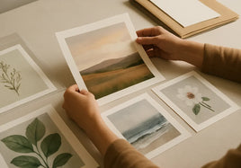
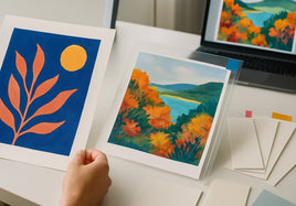
Every artist and photographer knows the frustration of printing a beautiful image, only to find the colors look completely different on paper. This guide explains how to manage color across screens, printers, and media to achieve the same vibrancy and accuracy you envisioned during creation.
What Is Color Management?
Color management is the process of maintaining consistent and accurate color reproduction across devices—monitors, cameras, printers, and mobile screens. In short, it ensures that the color you see while editing is the same one you’ll see in your final print. Without it, your blues might shift to purple, or your reds may appear dull and muted.
For artists selling giclee prints or photographic reproductions, good color management is crucial. It builds trust with collectors and keeps your work looking professional across every edition.
Understanding Color Spaces
Color spaces define how colors are represented digitally. The most common are sRGB, Adobe RGB, and CMYK. Each has a different range, or gamut, of colors it can display or print:
- sRGB: Standard for web and mobile devices. Ideal for digital display but limited for printing.
- Adobe RGB: Offers a wider color gamut, especially in greens and blues. Preferred for fine art printing.
- CMYK: Used by printers to mix pigment inks (Cyan, Magenta, Yellow, and Black). Essential for accurate physical reproduction.
If you’re working with both web and print, edit in Adobe RGB and convert to sRGB for online use. When preparing files for print, always embed your color profile before uploading. Our printing guide covers file prep steps in detail.
How to Calibrate Your Monitor
Monitor calibration is the foundation of accurate color work. Your screen may appear too bright or too cool out of the box, which can mislead your edits. Use a colorimeter or calibration device to adjust brightness, contrast, and color temperature to industry standards.
Calibration ensures that the colors on your screen match real-world tones. For best results, recalibrate monthly and work in neutral lighting conditions. Monitors gradually drift over time, so regular checks are key to consistency.
Soft Proofing and Test Prints
Soft proofing allows you to preview how your image will look in print using your printer’s ICC profile. This digital simulation helps identify problem areas before committing ink to paper. Most professional programs like Adobe Photoshop and Lightroom include soft proofing tools under “View Proof Setup.”
Once soft proofing looks good, create a small test print. Compare it under consistent lighting conditions—ideally with bulbs rated around 5000K (neutral daylight). Subtle differences between screen and print can usually be adjusted through small tweaks to brightness or saturation.
Adjusting Color for Print
If your prints look darker or duller than expected, check your screen brightness. Computer monitors emit light, while prints reflect it, meaning digital images often appear brighter than paper reproductions. Lower your screen brightness while editing to get a closer match to your prints. Learn more about setup and file adjustments in our ICC profile guide.
Best Practices for Color Management in Printing
- Work in Adobe RGB or ProPhoto RGB for maximum color depth.
- Embed color profiles in all exported files.
- Calibrate your monitor monthly and view under neutral light.
- Use printer-specific ICC profiles for your chosen paper type.
- Soft proof before printing to identify issues early.
When to Ask for Expert Help
Color correction is both science and art. It requires technical accuracy and a trained eye. If you’re still getting inconsistent results, working with a professional print lab like The Stackhouse Printery ensures that every detail is dialed in—from monitor calibration to final print inspection.
Ready to see your work reproduced with color accuracy and depth? Contact The Stackhouse Printery team today for personalized file prep help or request a free media sample set to compare how different papers affect your color output.